

A chart that stinks and one that doesn't
A chart that stinks and one that doesn't

A chart that I have refrained from updating is energy's relative performance around Fed rate cuts.
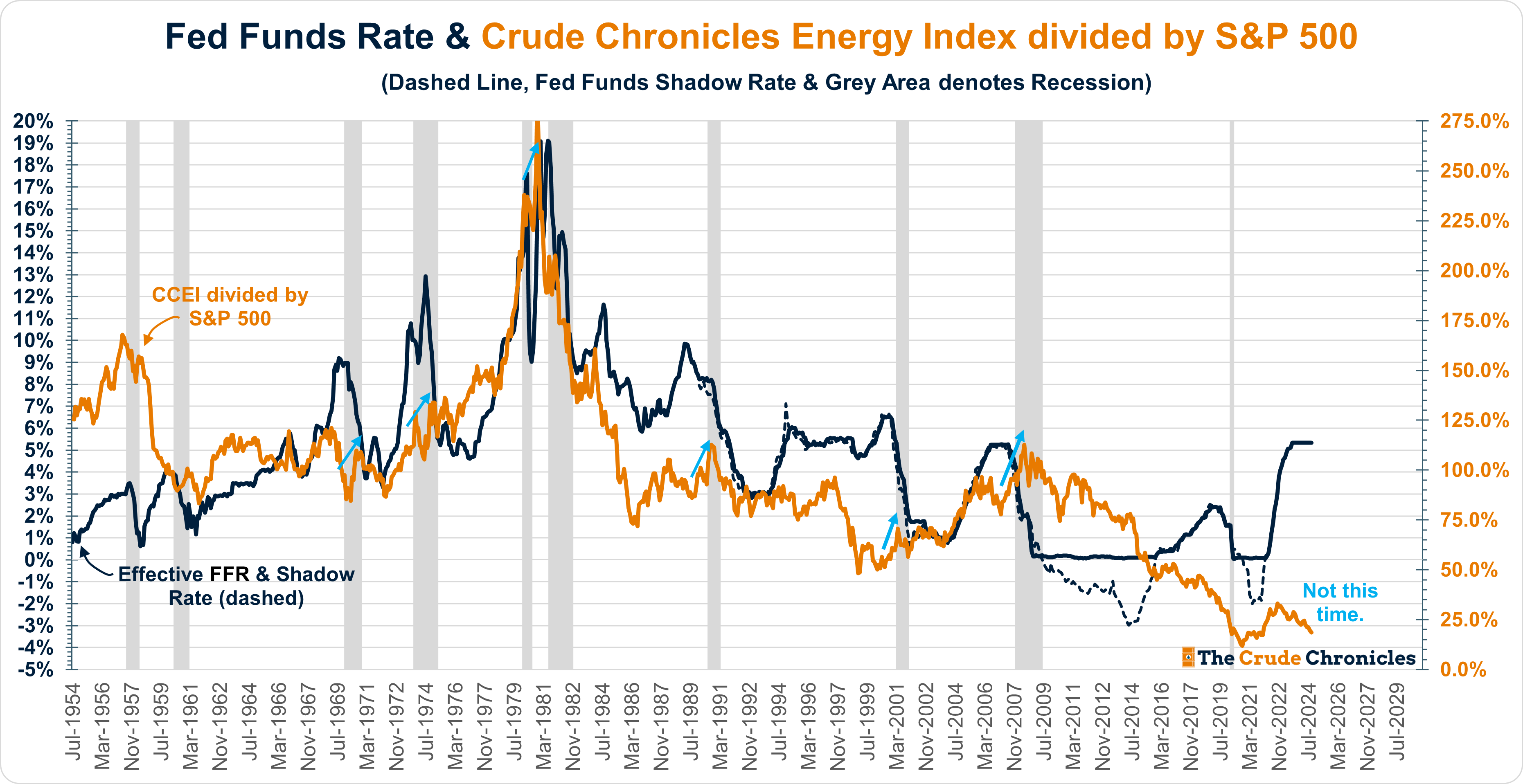
The blue arrows in the chart are meant to highlight that energy’s relative strength often gains momentum ahead of a Fed rate-cutting cycle.
But not this time.
A rate-cutting cycle typically follows a series of hikes, which are usually driven by rising inflation and energy prices. However, energy prices have not been rising since the summer of 2022.
This goes to show that charts (even mine) can sometimes lead one down the wrong path.
That said, a chart increasingly on my radar is the following: OFS multiples divided by Integrated Oil multiples, or 'risk-on vs. risk-off,' as shown below.
Keep reading with a 7-day free trial
Subscribe to The Crude Chronicles to keep reading this post and get 7 days of free access to the full post archives.