


114.5 years of Capex data - 2023 mid year update

2Q reports are well behind us and now begins the push through the holidays.
One thing my sell-side career taught me is you never publish a great piece of content before Labor Day when eyeballs are at the beach and not their computer screens hence the delay in publishing this post.
These are the charts that put this blog on the map.
Peeps love these long-cycle big-picture views. It’s my jam!
So with this week’s post, I am gonna provide a mid-year update to the capital spending charts that are the foundation for the bull thesis on energy.
The overarching conclusion is that the industry continues to underspend.
But if that is not enough for you, in this post I will also touch upon:
2023 YTD capex numbers relative to history.
Show how capex intensity continues to rise and which sectors this tends to benefit.
As a bonus, I will throw in a couple of downstream capex charts that may raise some eyebrows.
Quick programming note - For the 2023 data I simply annualized 1H23 numbers by multiplying by two.
I know that a lot of you like to use these charts so for all my paid subscribers (love you guys & gals) I always include a weekly chart pack at the bottom of this post.
Let’s begin.
The industry continues to underspend
I love this chart for its simplicity. It is upstream spending vs. crude oil prices.
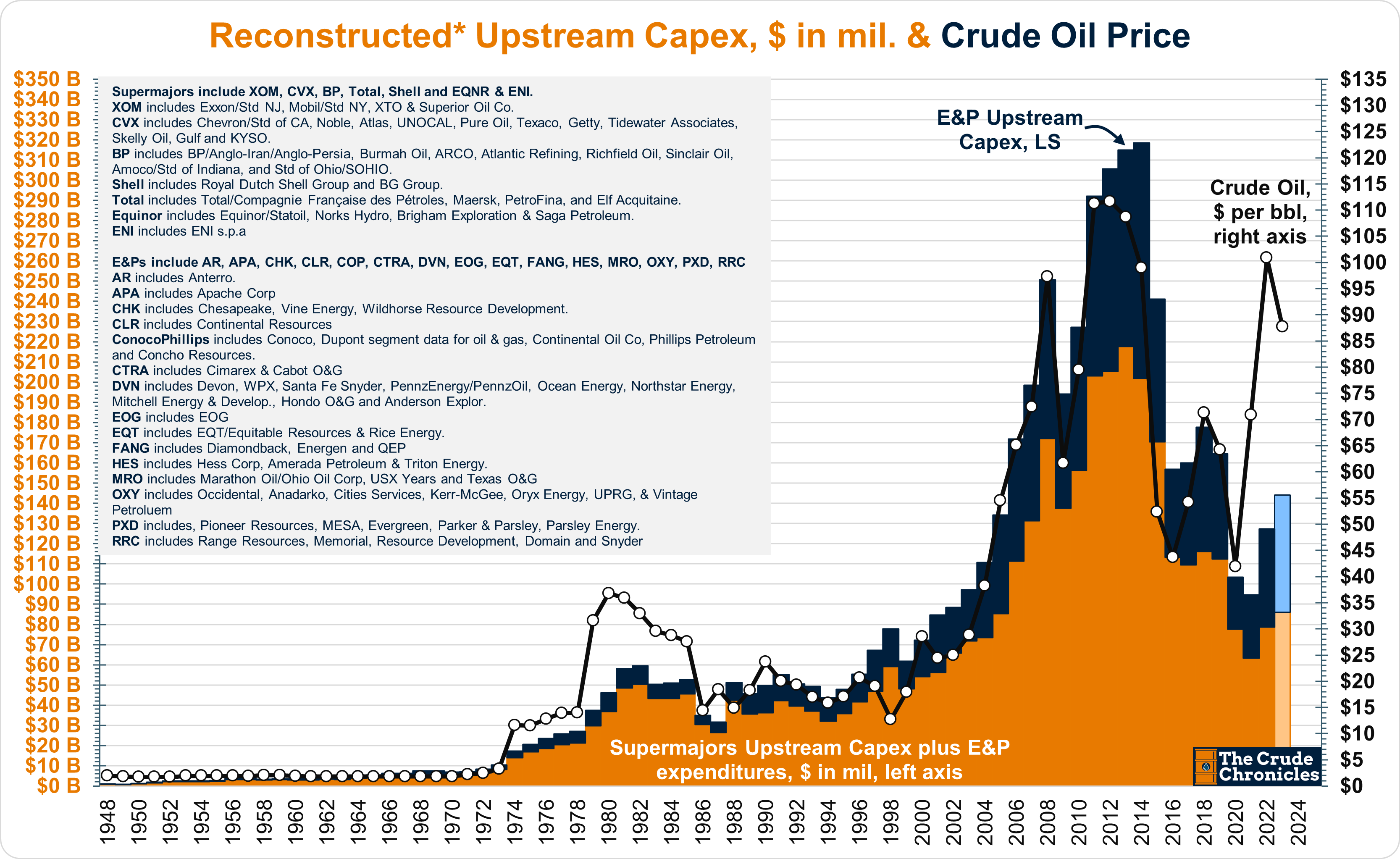
The chart shows how much the industry continues to underinvest relative to current prices.
Since 1948 the relationship between oil prices and capex has exhibited a 0.88x R-squared as shown in the chart below.
Keep reading with a 7-day free trial
Subscribe to The Crude Chronicles to keep reading this post and get 7 days of free access to the full post archives.