What’s up fellow Chroniclers.
First off a lot of peeps are new to my substack. I wanted to say thanks for trusting me with your attention. I hope to not disappoint.
Before we jump into some charts, let me give you a little background story.
About 18 months ago, I decided that I wanted to build the first ever oil/energy index going back as far as possible.
You can get a lot of price data from a simple Bloomberg download but it only goes back to the late 1970s if you’re lucky.
The only other way to get historical stock price data on a monthly basis is old newspapers. So that is what I did.
The charts here come from sifting through old newspapers for dozens of companies.
So what better way to kick the party off than with the direct descendant of Rockefeller’s Standard Oil Trust - Standard Oil of New Jersey now modern day ExxonMobil.
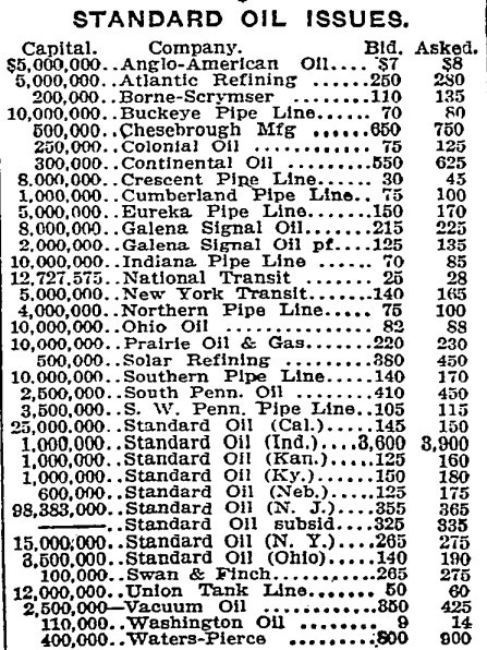
A picture of the stock quotes of the 34 companies that spawned from the breakup are shown below.
Check those bid-ask spreads! Brokers wish we could go back to those days.
From the left column (capital) you can see how much bigger Std of NJ was than all the other children.
OK, let’s dive right in!
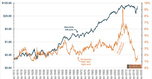
Let’s kick it off with Exxon’s share price both on an absolute (blue line) and divided by the S&P 500 (orange line) on a monthly basis since the breakup.
ExxonMobil share price since the dissolution of Standard Oil
Many of you have heard that energy’s weighting within the S&P500 is still well below where it stood ten years ago. This chart is a big reason why.
You can also see just how much XOM shareholders benefitted when Lee Raymond was at the helm. He will go down as one of the best CEOs in oil history. More on that later.
Exxon relative to the S&P500 hit an all time low back in October 2020 and appears to have turned the corner.
That leads us into the next chart.
One of the things that drives big oil’s over/under performance vs. the market is returns on capital.
The top half of the chart below is XOM relative performance and the bottom half is return on capital employed (ROCE) for the company.
Return on Capital Employed Drives Share Price Performance.
Once again, you can see the effect Lee Raymond had on the stock in the last super cycle.
It was book ended by two acquisitions, Mobil at the bottom of the cycle. Perfectly timed.
XTO at the top. Poorly timed.
It appears both ROCE and relative performance may be turning a corner.
Next we have XOM and it’s cash crop, crude oil.
There is correlation as you would expect. But there are times when Exxon does well in a flat oil environment like the 1950s & 1990s.
Let’s Examine the Relationship between XOM & Crude Oil
So I put together some stats 101 charts below. On the left we have a scatter plot oil of oil and Exxon and the right chart shows the 24-month correlation coefficient.
Historical Correlation is Strong & XOM still looks Undervalued
R-squared is high enough for my likings at 0.82.
When I first published this in March, XOM was below trend but looks to have closed the gap
The chart on the right shows the 24 month moving correlation has strengthen a lot as of late
Relative EPS Drives Relative Performance.
The blue line is XOM EPS divided by S&P 500 EPS using Case-Shiller data. Orange line is relative performance.
A very strong correlation here. Amazing how it has held true over the last 110 years!
Eye balling it, XOM is at 1.86% of the S&P 500. But based on relative EPS it should be at 2.5%. At the current S&P that would be $110/sh.
Onto some valuation charts.
Exxon’s Valuation Compresses Over a Cycle. P/E is Still Early Cycle.
The blue line shows XOM’s P/E (trailing) begins a super-cycle at ~20x-25x and compresses down to high single digits.
The chart is a little sloppy in the recent year just given the first negative EPS in the company’s history.
It looks like we are in the early stages of multiple compression on rising earnings, a.k.a. a cycle.
Next we got total returns (price + dividends re-invested) for XOM and the S&P.
Which ya Choosing, XOM or the S&P for the next Decade?
One looks toppy and one looks like it’s finally back from the dead.
Haven’t seen this wide of a spread since September 1929…watch out.
The chart just screams bullish for XOM and all oils really.
Next, I adopt a chart from Robert Shiller’s excellent book, Irrational Exuberance (HERE).
In the book he introduces the concept of cyclically adjusted P/E ratio or CAPE. To calculate you inflation adjust the current price. Next you inflation adjust earnings. Then you divide price by the 10-yr average of inflation adjusted EPS or cyclically adjust earnings power.
XOM CAPE has been a good predictor of future returns
The blue line is XOM CAPE.
The orange line is the subsequent 10 yr total returns (divs + price) if you purchased on that date. Axis on right is Inverted.
So think of the blue line as a predictor of the orange line.
A bit of divergence in the orange line as of late but history shows that if you bought in 2020 your next ten years will feature a teens CAGR in total return. Will history repeat?
Next I examine Exxon’s relative P/E (XOM CAPE divided S&P 500 CAPE) over inflationary periods; post WW2, 1965-1981, the mild inflation of the 2000 and now is shown below.
Exxon’s relative multiple wins in an inflationary environment.
Clearly Exxon earns a premium multiple vs. the market when inflation is rising
The next chart shows Exxon’s dividend yield.
And just for fun, I included Standard Oil Trust’s dividend yield (on a monthly basis as well).
A 9% dividend yield has typically signaled a strong buying opportunity for Exxon & its predecessor.
We aren’t gonna see XOM at a 10% yield again for a loooooong time.
A ~9% Dividend Yield has historically been a good entry point.
And for the finale.
After the 1911 breakup, Standard of NJ was clearly the biggest sibling, but Standard of California, modern day Chevron, was the second largest.
I divide XOM by CVX share price going back to the break up below.
I’m not much of a technician but that looks like long term support!
I Know People Love CVX but this makes me love XOM more!
I could drop a bunch more but I’ll leave it there.
Hope you enjoyed.
Now let me ask you for a favor.
If you loved the content, please share
If you like the content, please subscribe
If you have some thoughts/opinions, leave a comment
Or option D, do none of the above and just stay tuned!
Disclaimer
I certify that these are my personal views at the time of this post. My views are my own and not attributable to any past or present. This is not a newsletter for investment advice and there is no financial advice explicitly or implicitly provided here. My views can and will change in the future as warranted by updated analyses and developments.
Best,
The Crude Chronicler


