The Gist: This post includes a chart I have not created until now: the production profile of Chevron by geography since 1916!
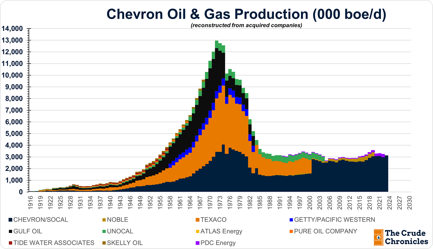
Some of my favorite charts to build are the following which shows Chevron’s oil and gas production since 1916 by acquired companies.
It lays bare the fact that when you reach a certain size (usually around 1 million barrels per day, though this is still up for debate), it becomes really, really hard to grow organically. Either the discoveries are not big enough to offset natural declines, or the amount of capital required is too large.
To put things into perspective, if we just isolate the oil segment, on a pro forma basis, these companies, when recombined at one point, were responsible for 20% of global oil production.
To put that into perspective, a 20% share is what the U.S. produces today or the combined production of Russia and Saudi Arabia!
However, after the 1970s and the loss of ARAMCO, their share has since fallen to where it is today of less than 2%.
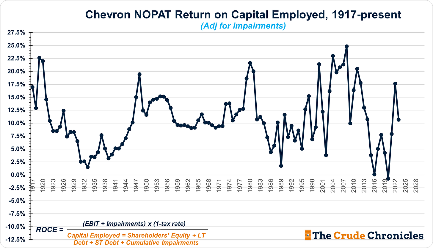
However, what recent years have taught us is that market share does not necessarily translate into returns. What truly matters for equity holders of oil and gas companies like Chevron are returns on capital.
Yet, the next chart is the one I have put off making until now: production by geography.
Keep reading with a 7-day free trial
Subscribe to The Crude Chronicles to keep reading this post and get 7 days of free access to the full post archives.


