Revenue & Profitability of Chevron
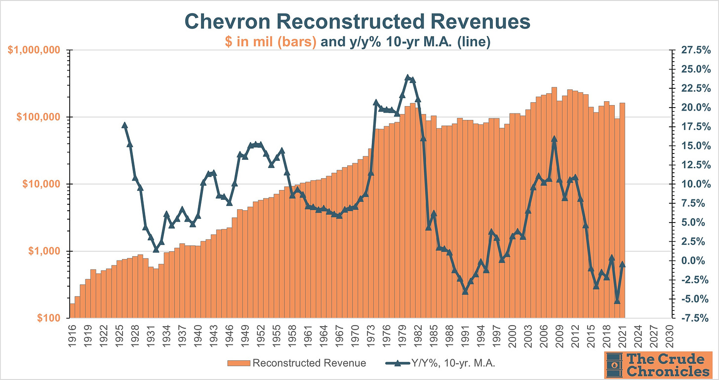
The chart below combines all acquired companies of Chevron displayed as bars on the left axis and the line applies a 10-years moving average of the Y/Y percentage change. Revenue growth may have turned a corner in 2021.
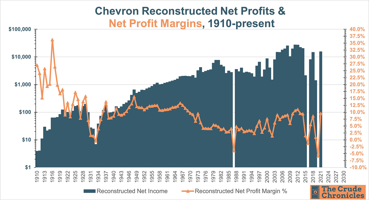
Below is the reconstructed net profits for Chevron including all the acquired companies.
Note the high margins of the 1920s which was attributable to the oil boom in Texas, California and Oklahoma. Margins were strong again in the 1970s prior to nationalization of the Middle East oil reserves. Profitability would recover during the 2000s super cycle as well. 2021 was a nice bounce as well.
Chevron Return on Investment Charts
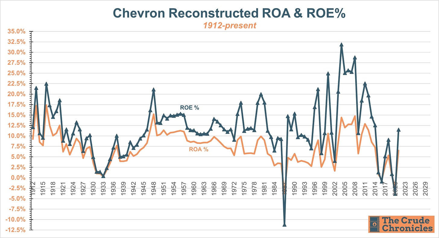
Net income, total assets and shareholders' equity are available as far back as 1912 so you get a look at the 4 cycles (the late 1910's/early 1920s, the post WW2 boom, the 1970s and the 2000s).
Now for some return on capital charts. You can see the calculation for EBIT ROIC in the chart. Many experts reference the 2000s and 1970s but the post WW2 cycle was just as powerful.
Keep reading with a 7-day free trial
Subscribe to The Crude Chronicles to keep reading this post and get 7 days of free access to the full post archives.


